Ben Balistreri Interview
CHARACTER DESIGNER FOR ANIMATION AND COMICS
Thursday, October 13, 2005
BROUGHT TO YOU BY THE CHARACTER DESIGN BLOGSPOT
IF YOU WOULD LIKE TO SEE MORE CHARACTER DESIGNERS GO TO THE HOME PAGE BY CLICKING HERE
THE INTERVIEW

1. How do you go about designing a character, from start to end?
I usually get an idea in my head for a design based on my initial reading of the script I'm designing for. Then I do research. I've really learned the importance of this in my professional years. I feel in the past I've resorted to designs that refer back to clichés that have become formulaic in the animation world. For instance if I'm drawing a trench-coat on a character I'll look up images of actual coats so I can caricature the coat my own way as opposed to falling back on what cartoonists before me have already done. I don't think I can stress the importance of this enough in my development as an artist. Next I rough out the big overall shapes (usually in non-photo blue prismacolor). I work over and over the drawing until I get the shapes and the structure looking interesting and simple. This step will make or break a design in my opinion. I really focus on drawing through the forms I'm creating (even in a flat graphic style) so the structure will look appealing and solid. Of course this structure must include varying shapes, no tangents, no twining or parallel lines, and attention to the style of the show. (For instance: Danny Phantom uses lots of straights against curves and harsh angles, while Lady and the Tramp has subtle shapes that refer more towards realism with little or no angles and straight lines that are hidden within the forms.) Then the fun comes in when I add the details. I usually overload every idea I have and then scale back until the design is simple enough. Once this is done I usually end up drawing over this initial drawing upwards of around 3 or 4 times to push the shapes loose any tangents or change details that I don't like. I go through a lot of designs to get to the final. I almost never go with my first idea.
2. What do you think really helps you out in designing a character?
Research as I mentioned above. Also there must be a style. A lot of student designs I see look a little generic because they haven't committed to a style. You don't need to copy Mike Mignola or Bruce Timm but you can use other artists as platforms to be inspired from. Try using a famous art movement like art deco to give your designs some focus. Use an artist that has nothing to do with animation like Gustav Klimt or Arthur Rackham. Above all be decisive! Make a choice and stick to it!
3. When does your comic book come out so we can buy it?
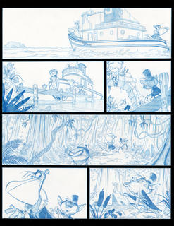
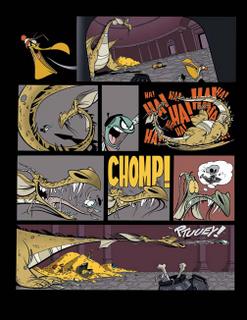
My comic which was supposed to be 40 pages has turned out to be 64. I've taken a lot of heat from my friends for how long it's taking me but I just don't have that many hours a day to commit to it. All 64 pages are drawn and I'm well into inking and coloring it. I expect if time permits to be published by October of 2006. I'm pretty happy with the story. It's come a long way since I started it. After I publish the initial book I'll put out an art of book with early story drafts and lots of roughs and thumbnails, but I want people to see the final comic first so they can enjoy the story, (hopefully!) I realize that's a long time from now, but I don't want to rush through any of it because I feel so passionate about it. Sorry.
4. What are your 10 favorite websites that you like to go to get inspired?
I don't get inspired from the computer very often and rarely web-surf. My partner at Nickelodeon was Stephen Silver, he surfs a lot and showed me a lot. I love books and would much rather sit on the couch paging through a book than scroll through a computer screen. I mostly look at French comics.
My favorite artists are Andre Franquin (a Belgian comic artist,) Albert Uderzo (creator of Asterix) Erich Sokol, (an Austrian character artist and I could list hundreds of Belgian and French comic artists who really inspire me.
5. From your own experience and maybe from some people that you know, what should we put in our portfolio and what should we not.
I always felt that figure drawings and zoo sketches were over rated in job portfolios. They are good for getting into art schools because they reflect a level of discipline and knowledge that are necessary to progress and learn more but studios want to see what your going to do for them on a tight production schedule. Now I can only speak from my experience working in the TV industry and certain feature houses might want something different. (recruiters at each studio will usually let you know what each studio is looking for.)
It is important, I feel, to pick a discipline within the animation realm and focus on it. If you want to draw layouts don't waste space with character designs. If you want to be a character designer putting in background paintings isn't going to impress any one. Directors fill jobs like a coach on a basketball team creates a starting line up. You pick specialists for each job that will work together as a team. They like to feel confident that the person they are hiring really knows
His/her discipline and isn't just falling into the role. Showing rough drawings is great but put in some finished clean work cause that's what you'll need to do on a production.
6. What are you working on now? (If you can tell us)
I'm still working on Danny Phantom, although recently I switched from just doing character designs to doing story boards as well. Butch Hartman, (creator of D.P. as well as the Fairly Oddparents gave me a great opportunity to try something other than design which I've been doing professionally for 7 years.) I just finished the first act and cold open of the first hour long Danny special which will probably be on TV sometime next year, I'm still doing main character development and I still draw all the Danny title cards as well.
9. Where is the place you would like to work if you had a choice?
I love working at Nickelodeon. They treat me with so much respect! I would like to do some work for Pixar. Their stories are all so fantastic!
10. Who do you think are the top character designers out there?
My favorite designer works for Dreamworks. His name is Nickolas Marlet, (I have no idea if I spelled that right.) I love the work of Joe Mosher at Disney (Hunchback, Emperor's New Groove, and Home on the Range.) Bruce Smith who created the Proud Family did an amazing job. I worked for Toby Shelton who designed Darkwing Duck, Rescue Rangers and Ducktails. He's a board artist at Dreamworks now but has some sick talent! Craig Kellman (again spelling!) Dexter's lab and Madagascar has the best handle on graphic characters for my money.
11. How do you go about coloring the character, what tools do you use?
I love my Pantone Letraset markers. I usually just color them over a zerox, or sometimes colored pencil. The past year I've really gotten into Photoshop, which is how I'm going to color my comic book. I don't consider myself a great color stylist, and have much admiration for artists who have the ability to come up with surprising yet appealing color combinations. I try to keep my colors slightly de-saturated and above all simple. I hate seeing out of control color.
12. Last but not least, If you have worked on a project with a team, what have you learned in being on a team, and what did you like about it, also what is the process like?
All of animation is a team process and if you have too much of an ego about getting name recognition your in the wrong business. It's tough sometimes to not have everyone see things your way but it can also be really cool to get different ideas to get a better product. A lot of it is the attitude you choose to have going into it. For instance in designing the Alien Tiger Felos for Crash Nebula, Butch took a design I loved and started to stick a post-it on the face.
I cringed as I was pretty happy with the design! He wanted it to look more alien and added fins in place of the hair I had on the side. He then told me to change the color from orange to blue. The end result was much cooler than anything I would have designed on my own. Almost nothing in this business is the result of one person's work, but is usually a quilt of different ideas.
I used to share office with Stephen Silver (silvertoons.com) and we had a great relationship with sharing ideas and opinions. We would go over each other’s designs and I think we both have grown as artists due to the collaboration. That being said all artists have strong opinions, and it can be challenging to get those opinions in sink. I do love the freedom of doing my own art like my comic where I can make every decision and not have to answer to anyone.
IF YOU WOULD LIKE TO KNOW MORE ABOUT BEN BALISTRERI, GO TO
http://benbalistreri.blogspot.com/
CLICK HERE TO GO BACK TO THE CHARACTER DESIGN HOMEPAGE
Subscribe to:
Posts (Atom)
